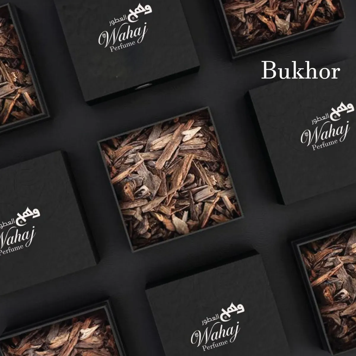
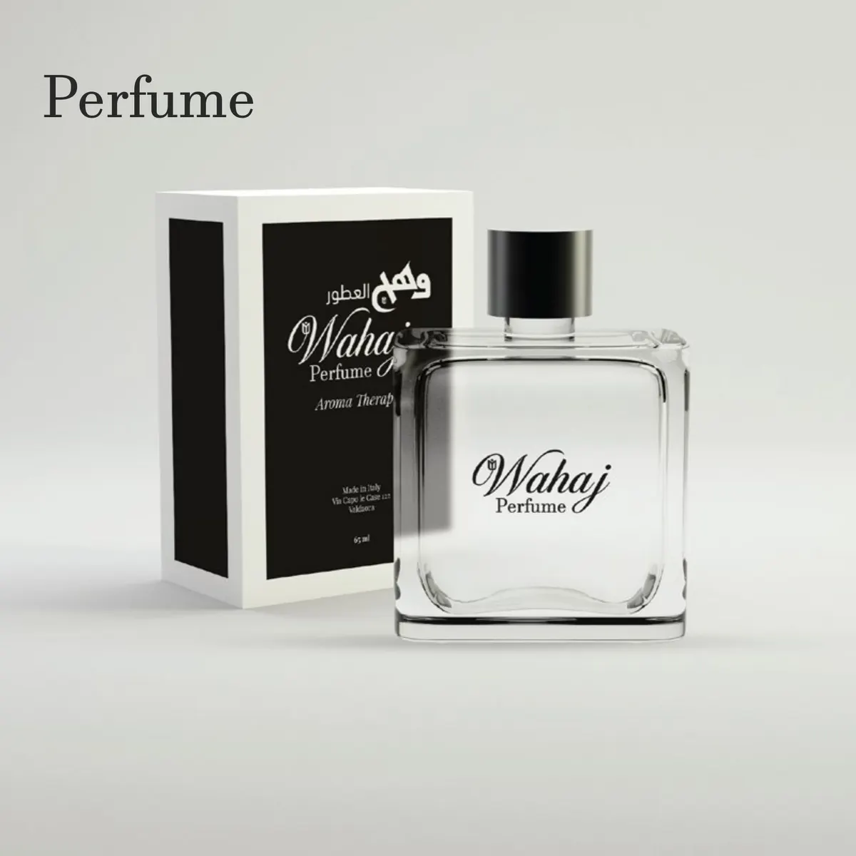
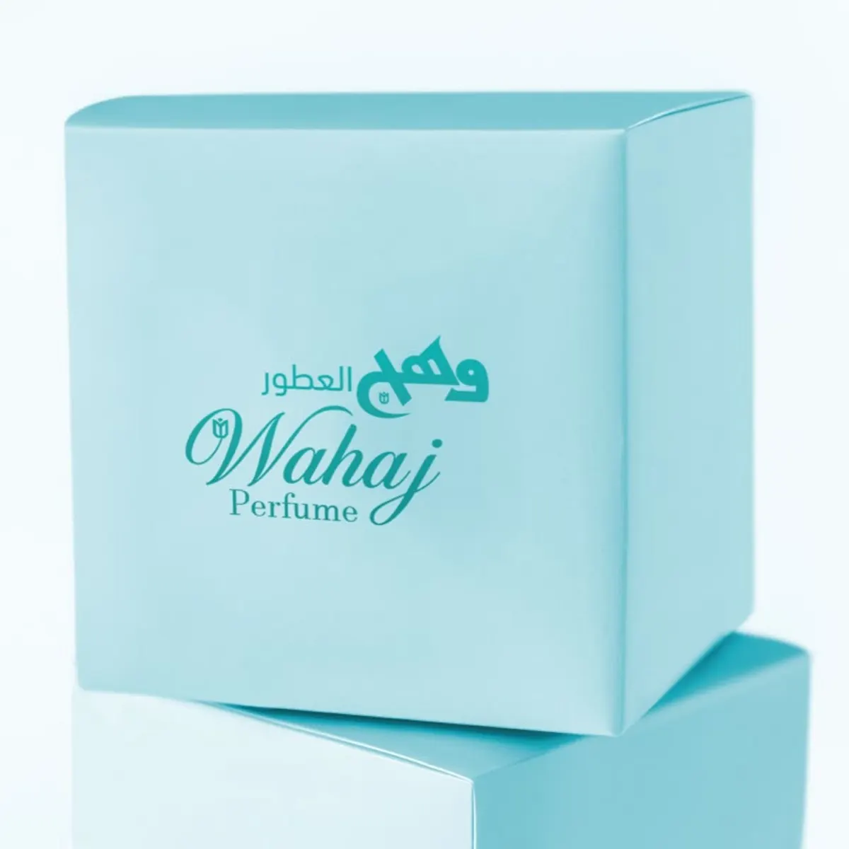
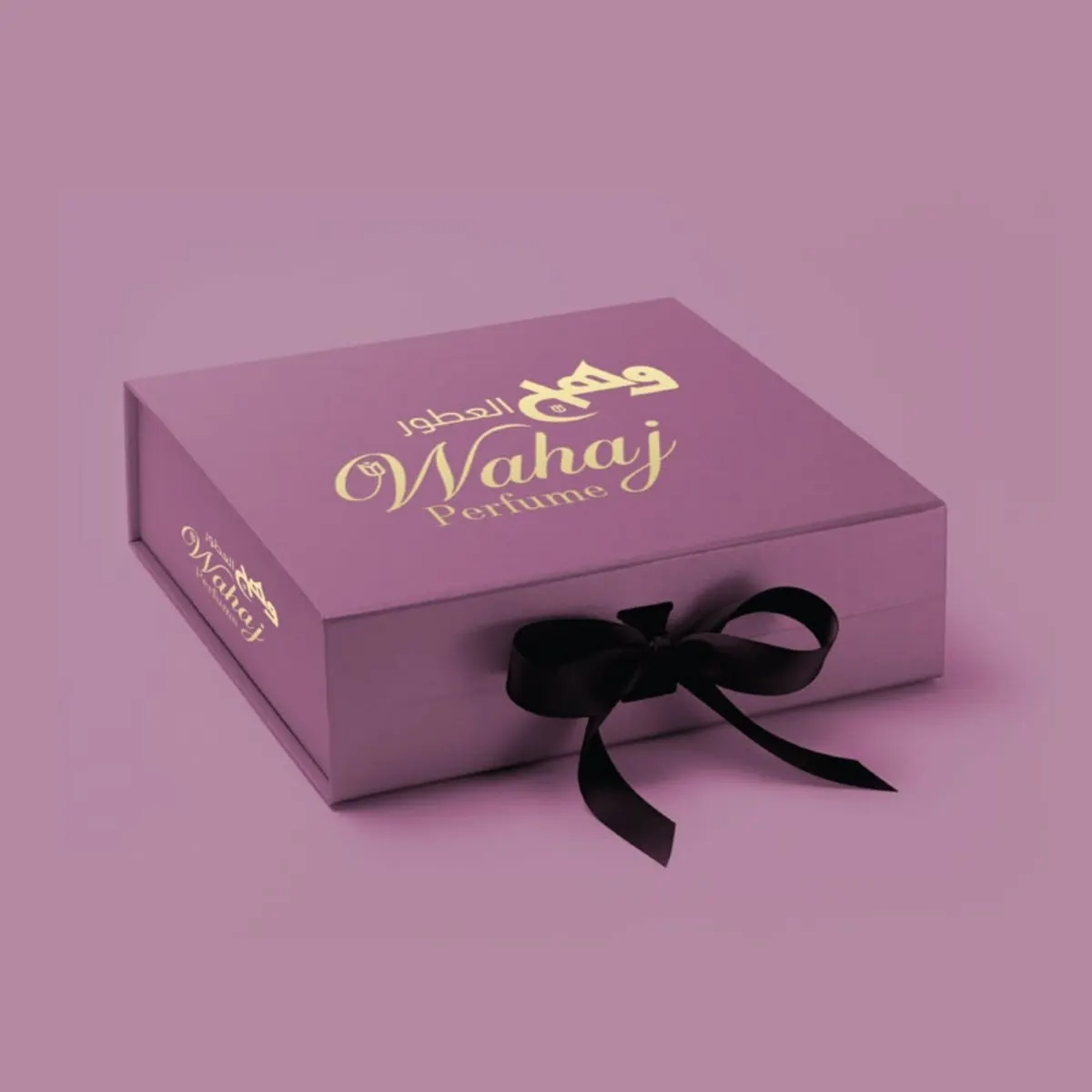
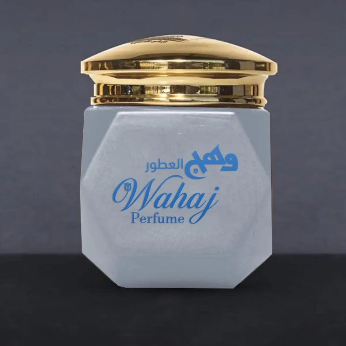
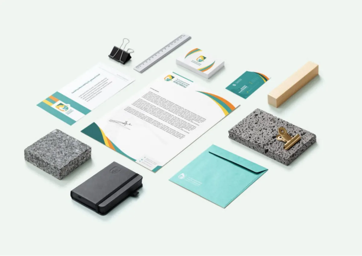
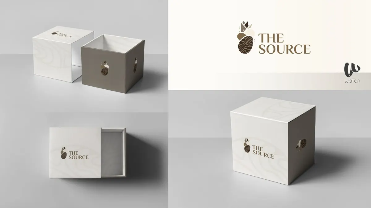
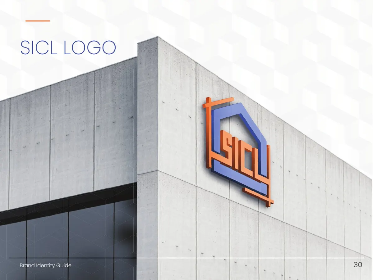
The supplied guide combines an Arabic and English wordmark with a blue-led palette and complementary product colours. This gives the brand a consistent signature while allowing individual collections to have their own expression.
Inside the work
How it was executed
The guide defines logo usage, typography, patterns, photography direction and social layouts, then demonstrates them on perfume, incense, body-care and gift packaging. The project is presented through selected product and packaging mockups.
Watan’s role
From idea to a complete work
Building Wahj’s bilingual identity system and extending it across perfume, incense, care products, packaging and social content.
Why this approach
What makes the idea a fit?
The system differentiates product collections while retaining a consistent brand signature across sizes, categories and channels.
The execution sequence
Establish the bilingual mark and palette.
Define typography, patterns and photography direction.
Apply the identity to products, gifts and social templates.
Project details
Brand identities
Related projects
Explore more projects from the same service category.