The project idea
The project story
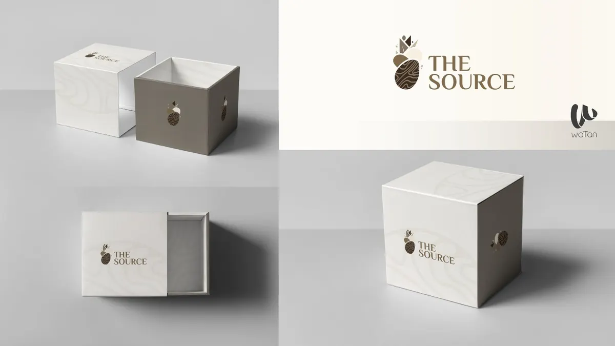
The Source presentation pairs a botanical emblem with a serif wordmark and a warm neutral palette. The result is a visual direction centred on texture, simplicity and a consistent branded experience.
A restrained visual identity expressed through packaging, shopping bags and brand stationery.
The project idea
The Source presentation pairs a botanical emblem with a serif wordmark and a warm neutral palette. The result is a visual direction centred on texture, simplicity and a consistent branded experience.
Inside the work
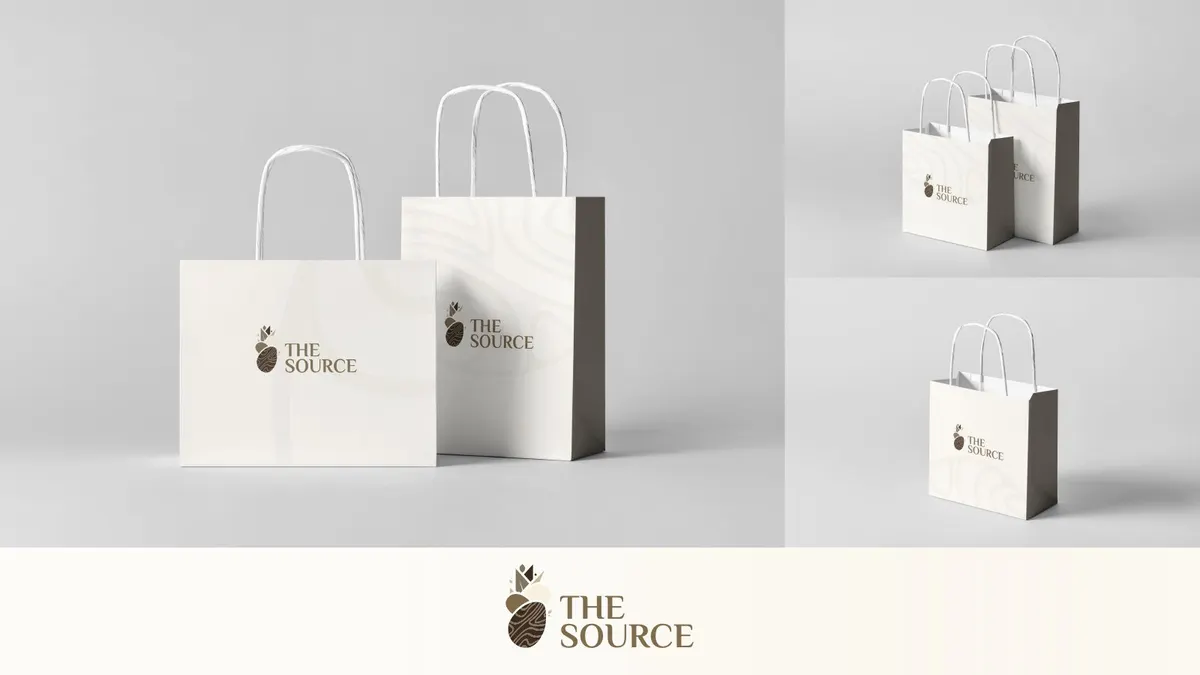
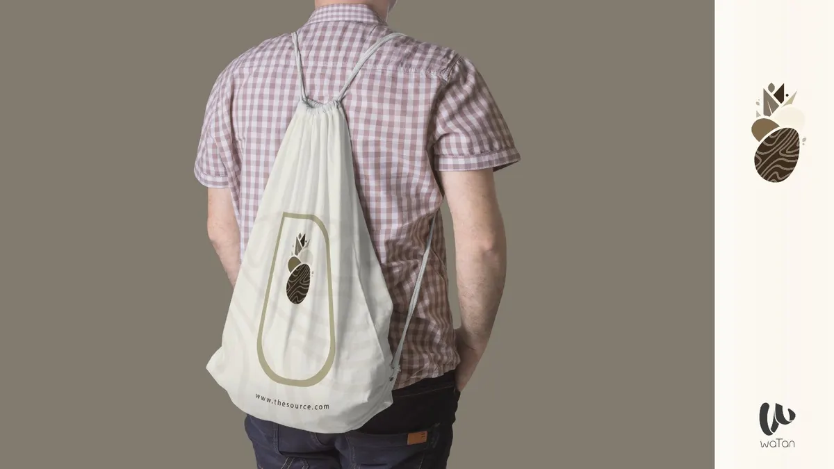
The identity is shown across boxes, paper bags, a tote and stationery. The applications use generous space and controlled logo placement so that the same visual character carries across different materials and sizes.
Watan’s role
Shaping The Source identity across packaging, shopping bags and stationery, using space and logo placement to connect different materials visually.
Why this approach
The identity becomes something the customer handles; repeated symbols and colours connect packaging with the brand experience.

Brand identities
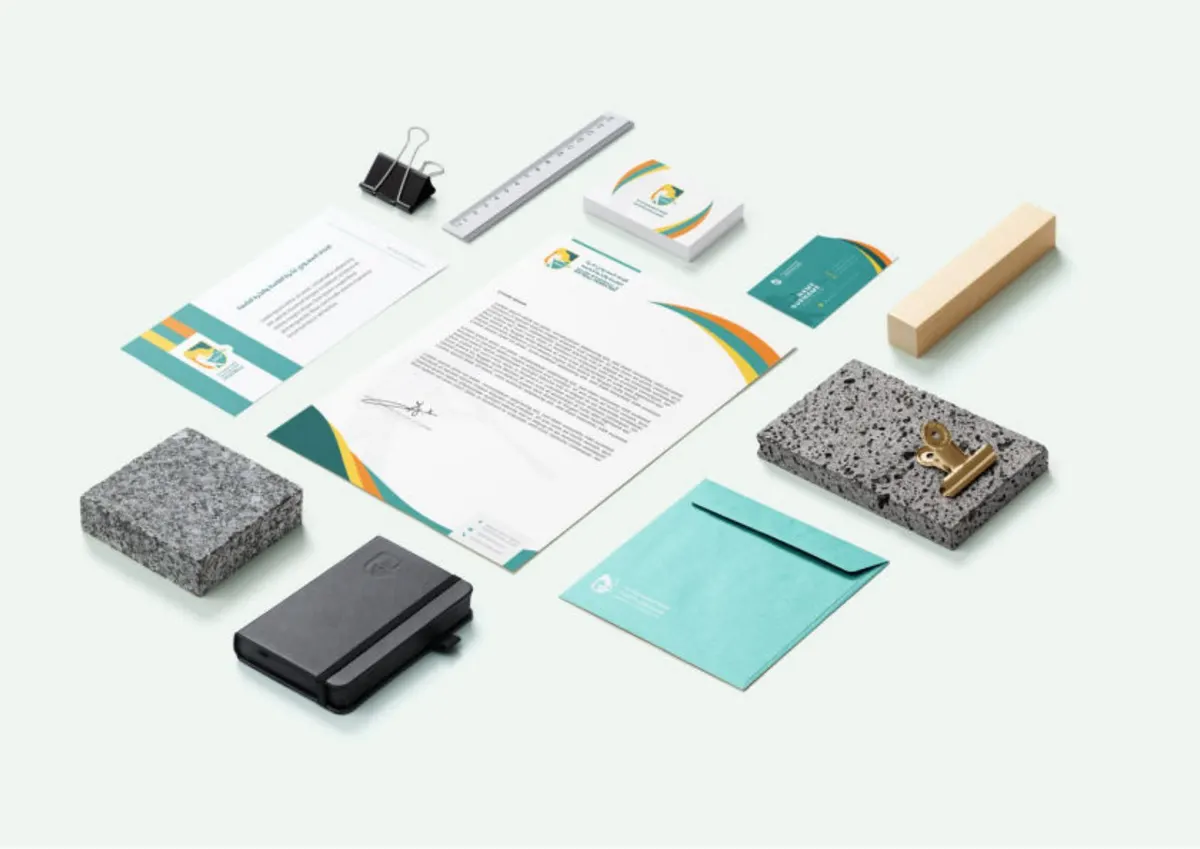
A complete sporting visual system, from the federation emblem to equipment, stationery and outdoor applications.
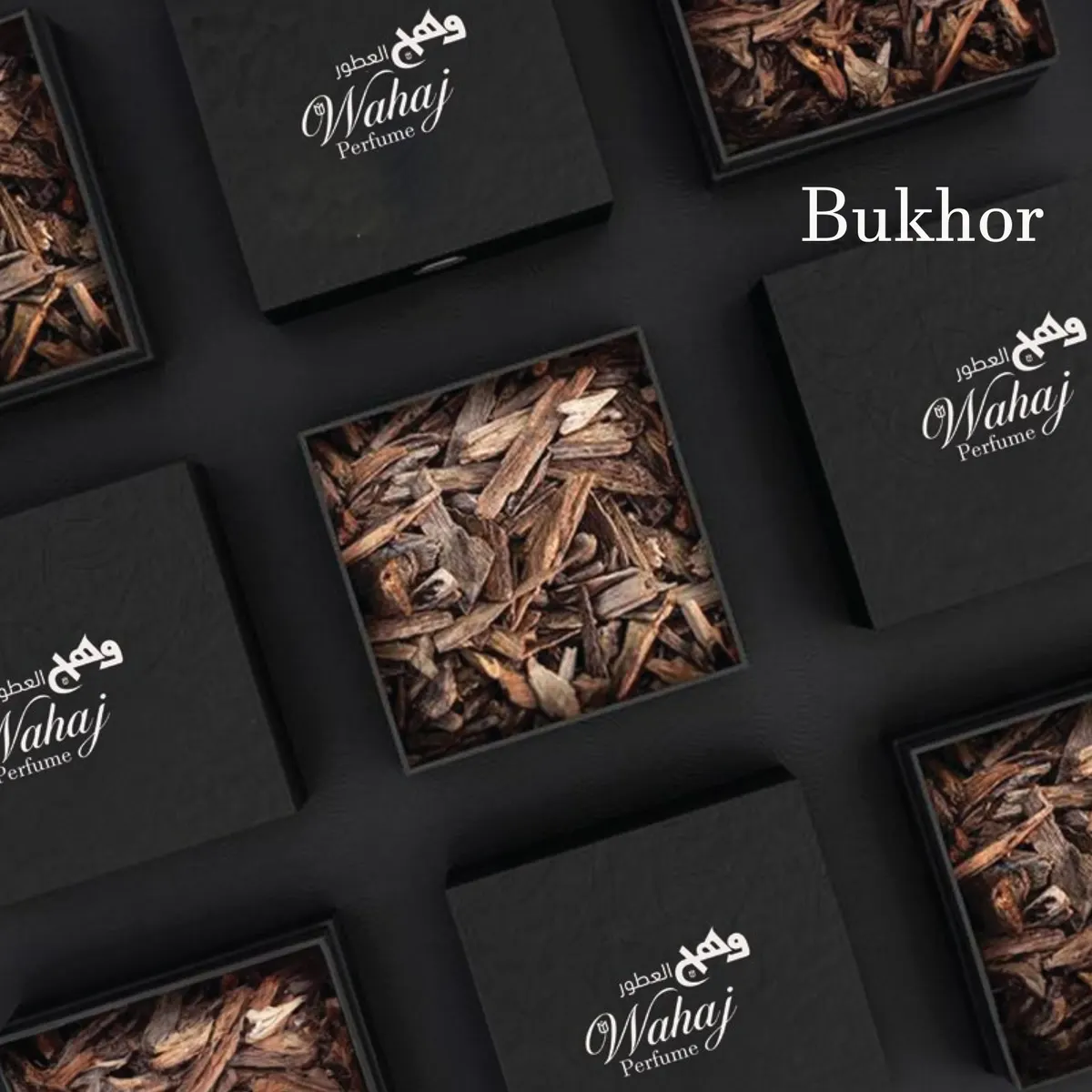
A perfume identity system spanning product families, packaging and social content.
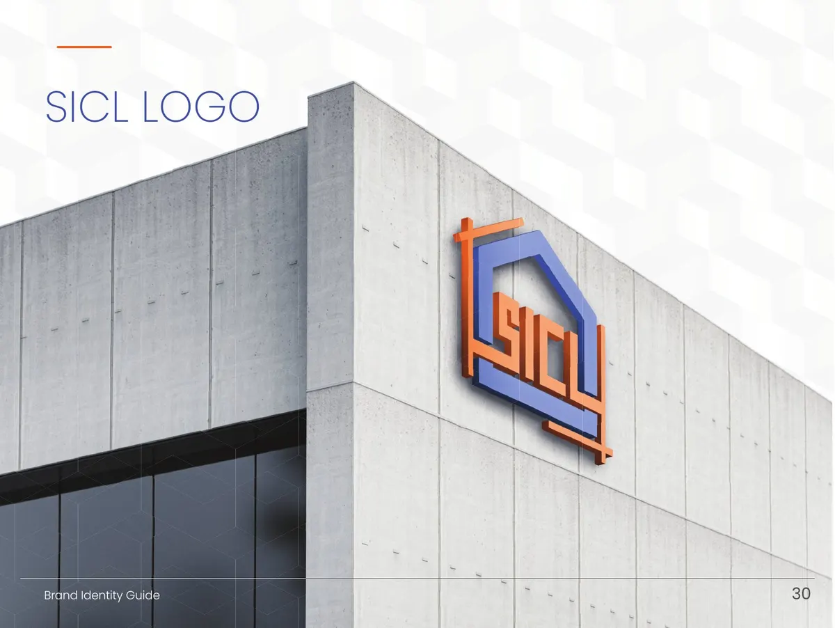
A brand system designed to remain consistent across site equipment, signage and corporate communication.