The project idea
The project story
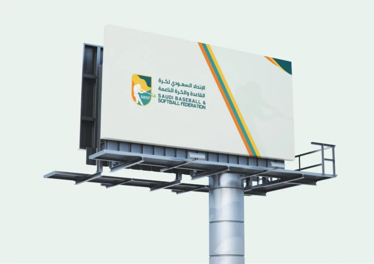
The identity brings baseball and softball into a recognisable visual language. A shield, player silhouette and a green-and-yellow palette connect the federation mark with the energy of the sport.
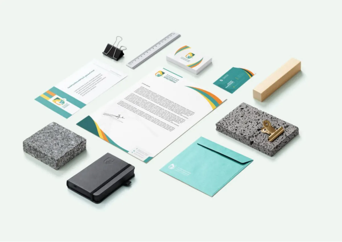
A complete sporting visual system, from the federation emblem to equipment, stationery and outdoor applications.
The project idea
The identity brings baseball and softball into a recognisable visual language. A shield, player silhouette and a green-and-yellow palette connect the federation mark with the energy of the sport.
Inside the work
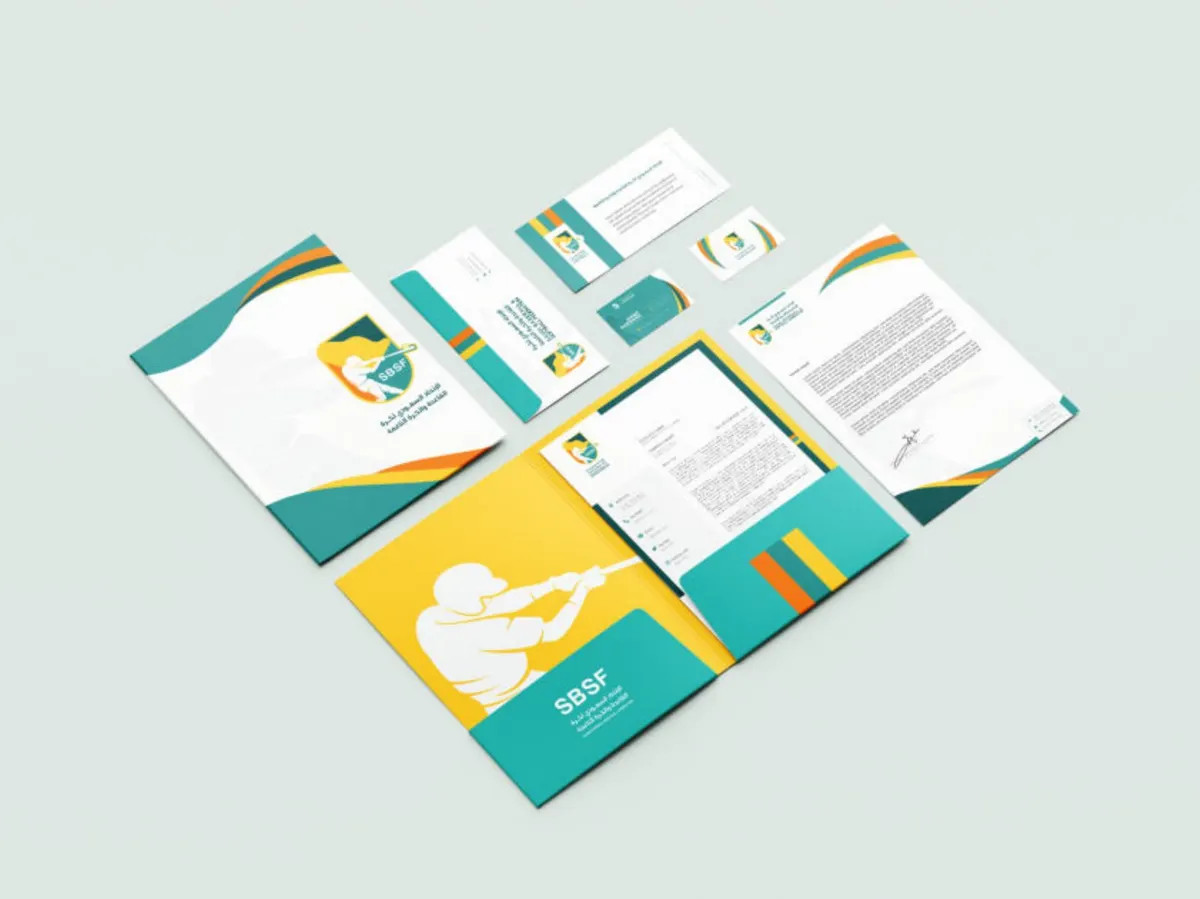
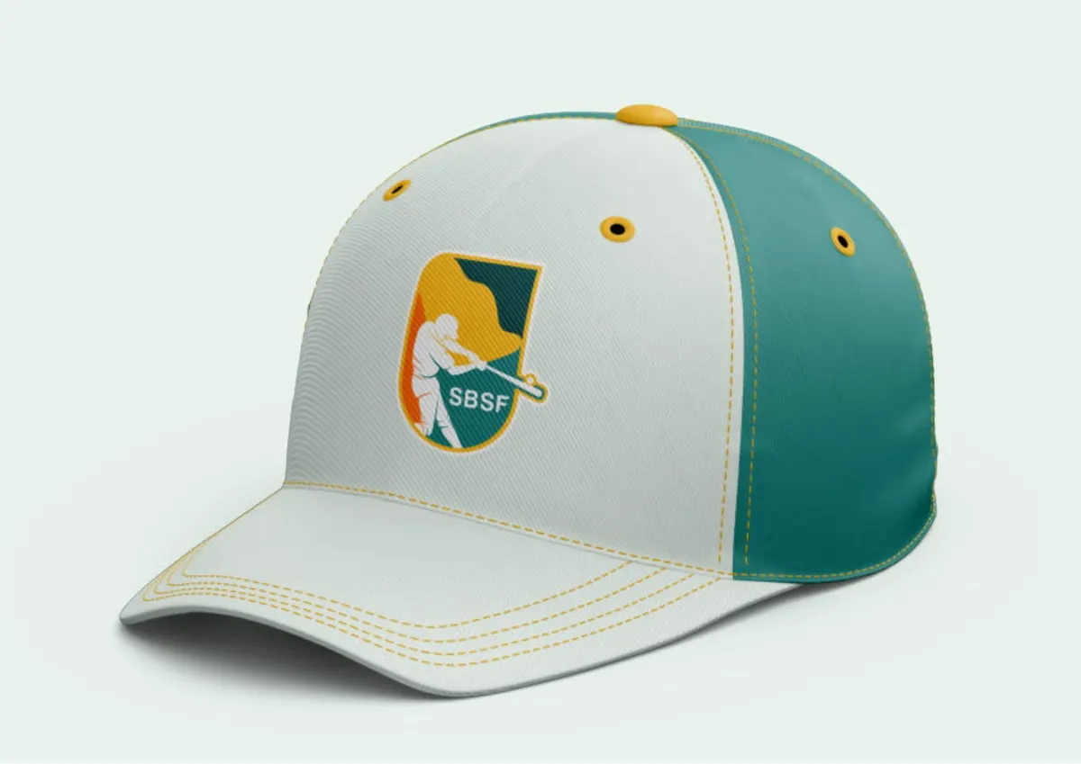
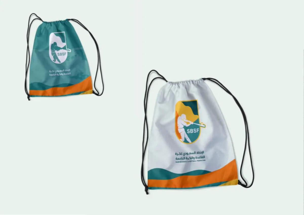
The supplied brand guide develops the mark into player and equipment illustrations, flowing graphic shapes and repeatable layouts. Applications extend across caps, bags, badges, stationery and outdoor signage, with rules for logo size, colour and co-branding.
Watan’s role
Developing the federation’s visual system, from its emblem and colours to illustrations and applications connecting its sporting and corporate presence.
Why this approach
A consistent identity across apparel, equipment and signage helps the federation present one recognisable character at different touchpoints.
Brand identities
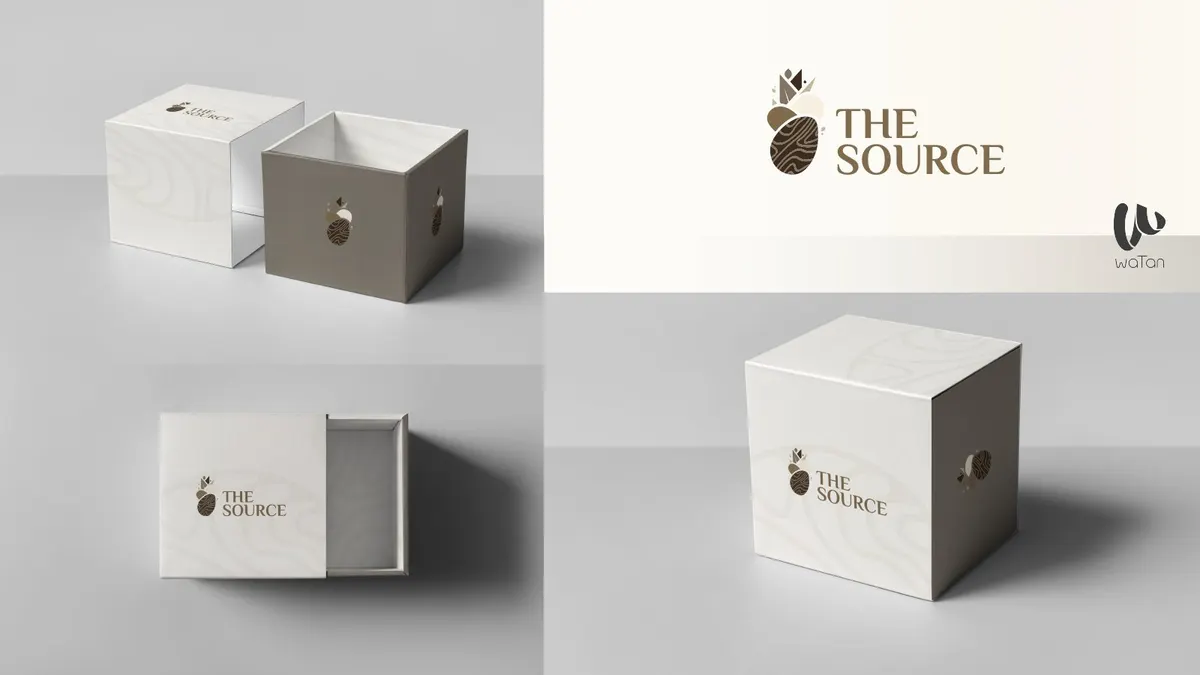
A restrained visual identity expressed through packaging, shopping bags and brand stationery.
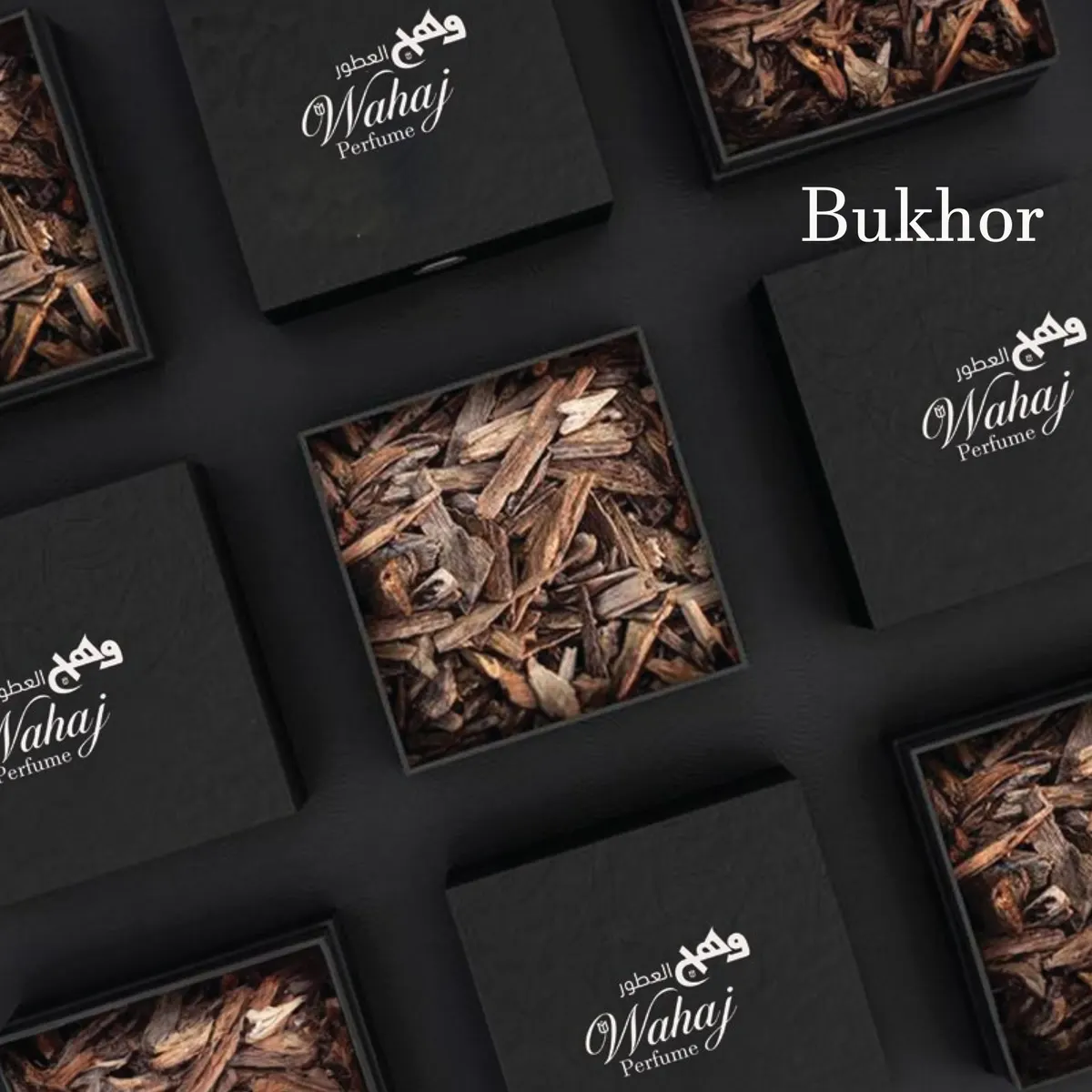
A perfume identity system spanning product families, packaging and social content.
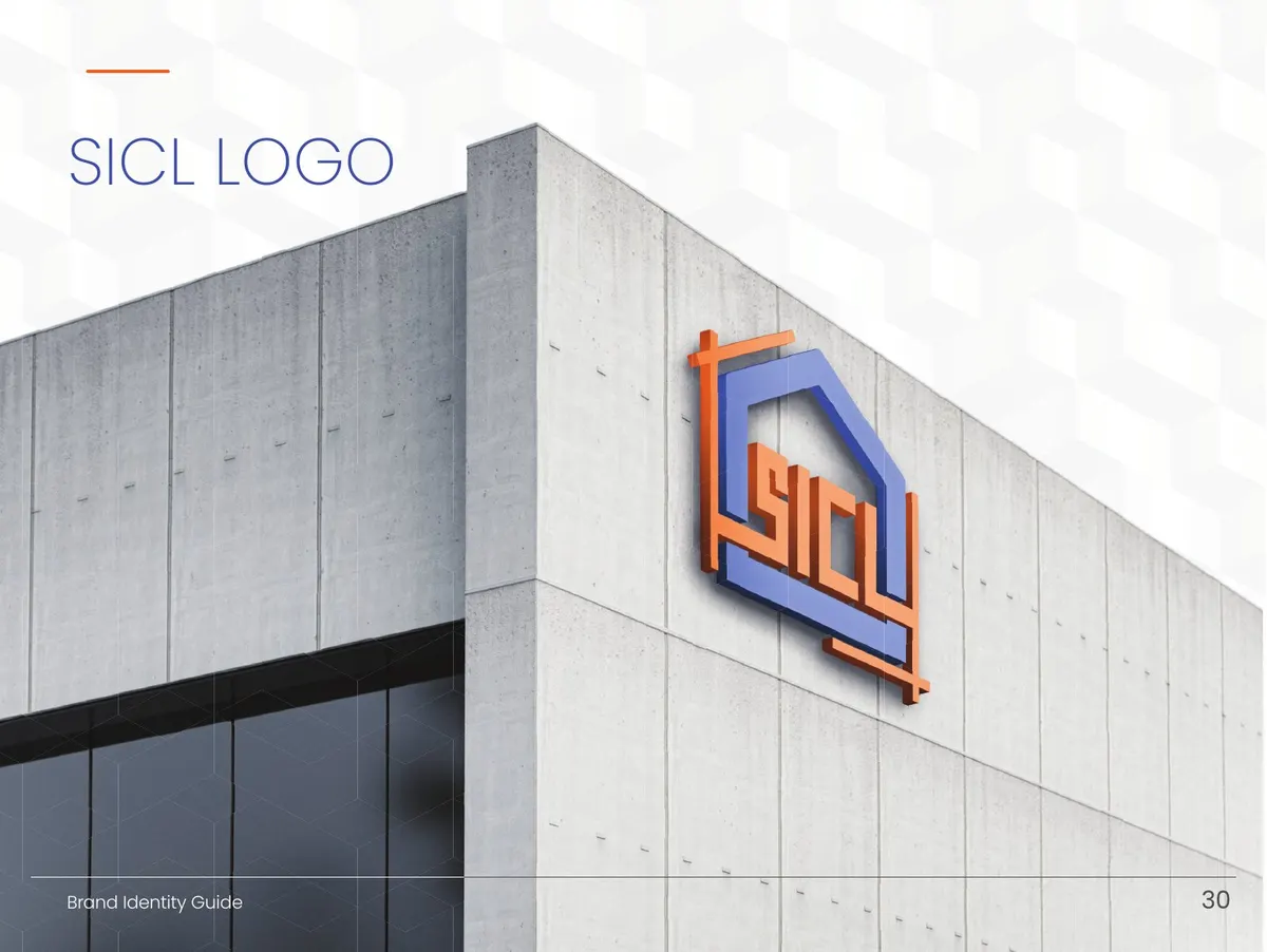
A brand system designed to remain consistent across site equipment, signage and corporate communication.