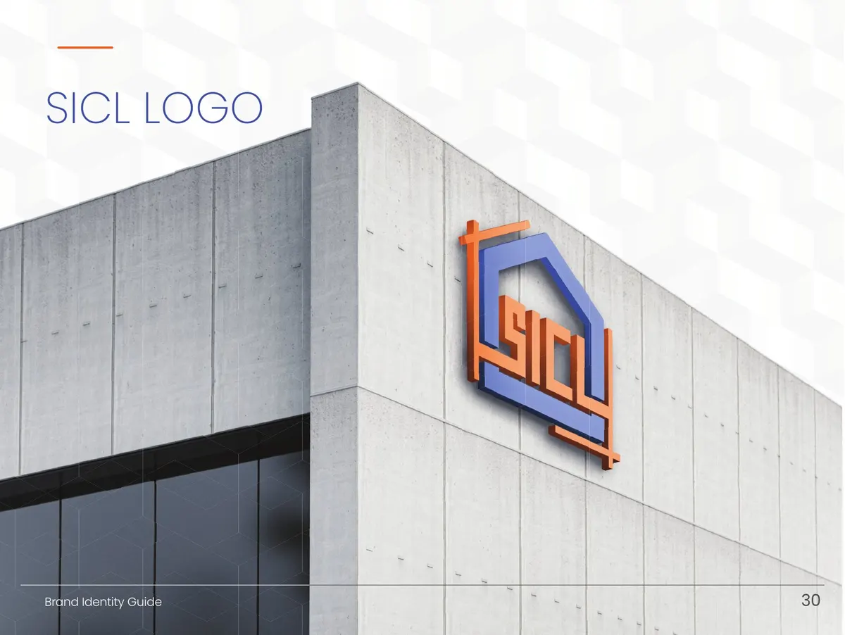
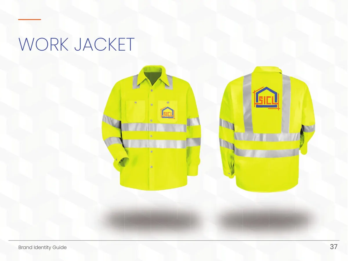
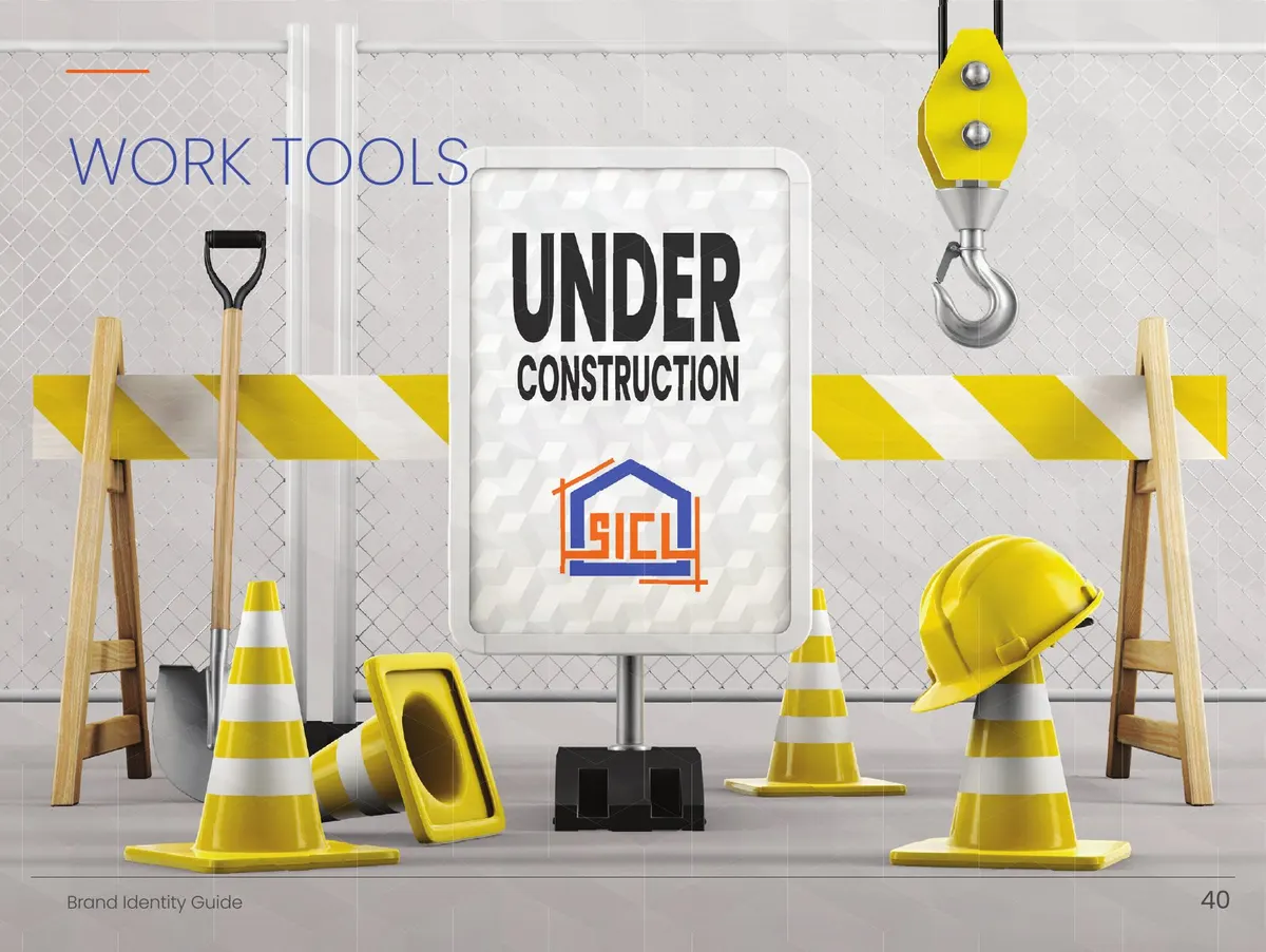
The SICL guide builds its visual language around a geometric mark, a blue-and-orange palette and structured typography. The applications place the identity in the practical context of buildings, workwear and site equipment.
Inside the work
How it was executed
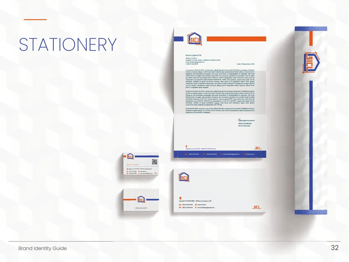
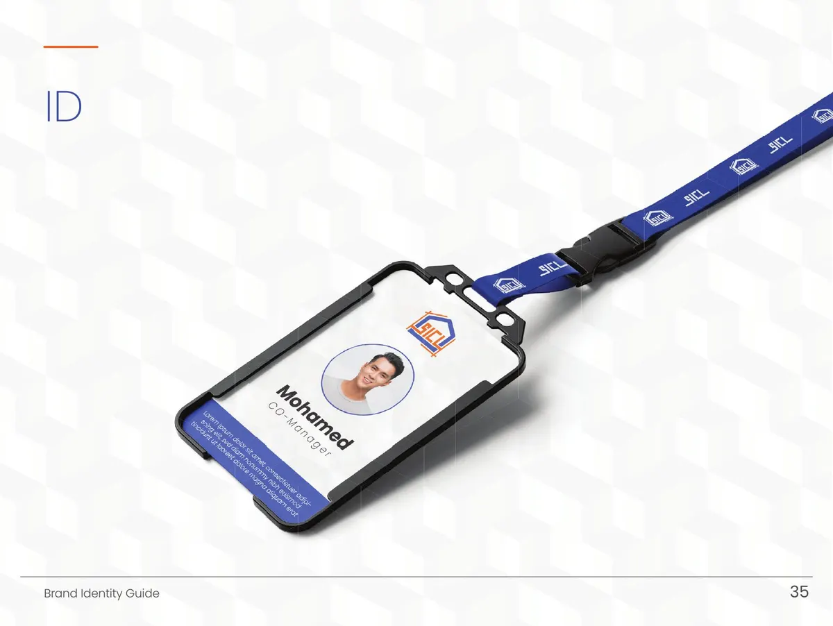
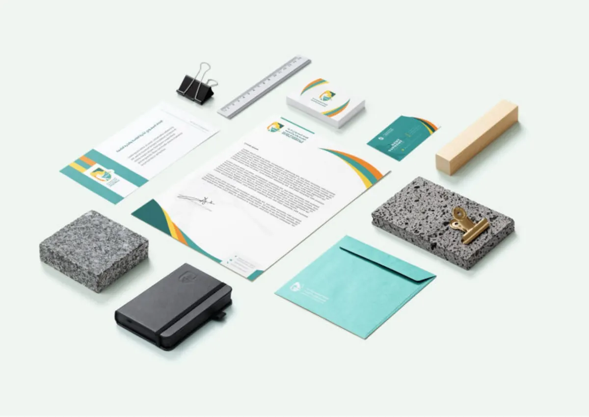
The identity extends from letterheads and business cards to hard hats, flags, work jackets and identification badges. The guide also defines logo spacing, incorrect usage, colour and graphic-pattern rules to support consistent rollout.
Watan’s role
From idea to a complete work
Developing SICL’s identity and usage rules, then translating them into corporate and site applications on stationery, workwear and equipment.
Why this approach
What makes the idea a fit?
The identity links formal corporate communication with the working environment and provides rules for different surfaces and sizes.
The execution sequence
Build the geometric mark, colours and typography.
Specify spacing, patterns and usage.
Show the identity on stationery, safety helmets and signage.
Project details
Brand identities
Related projects
Explore more projects from the same service category.