The project idea
The project story
The guide combines a playful wordmark, saturated yellow and a broader product palette to create a recognisable family of expressions.
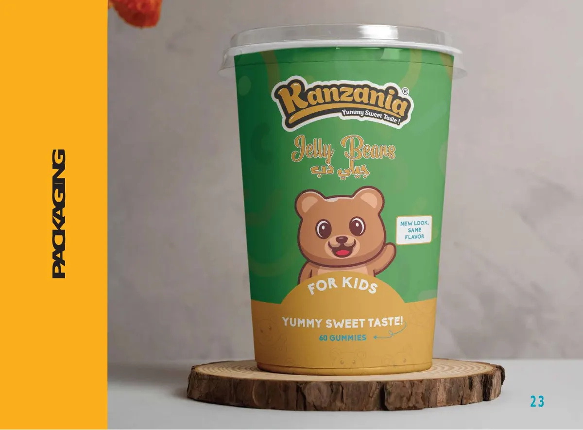
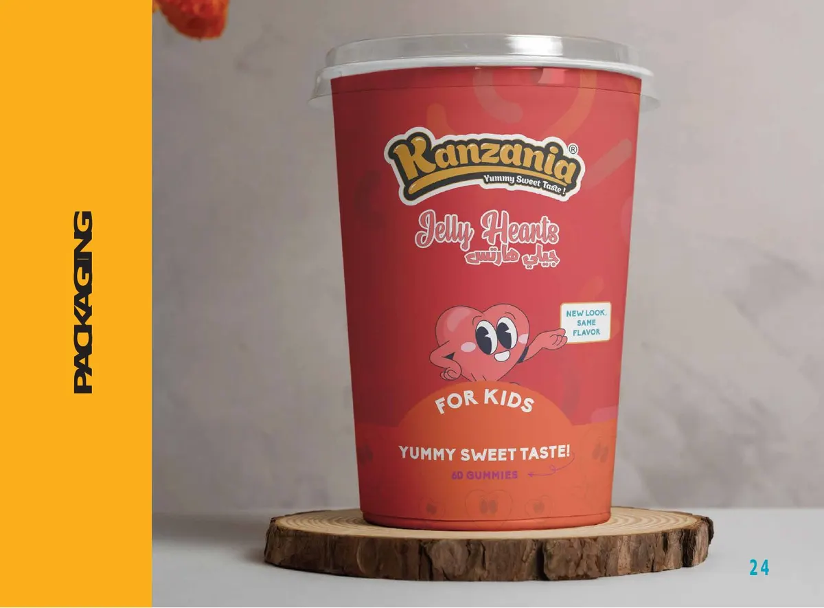
A lively visual system with bilingual logos, product packaging and social applications.
The project idea
The guide combines a playful wordmark, saturated yellow and a broader product palette to create a recognisable family of expressions.
Inside the work
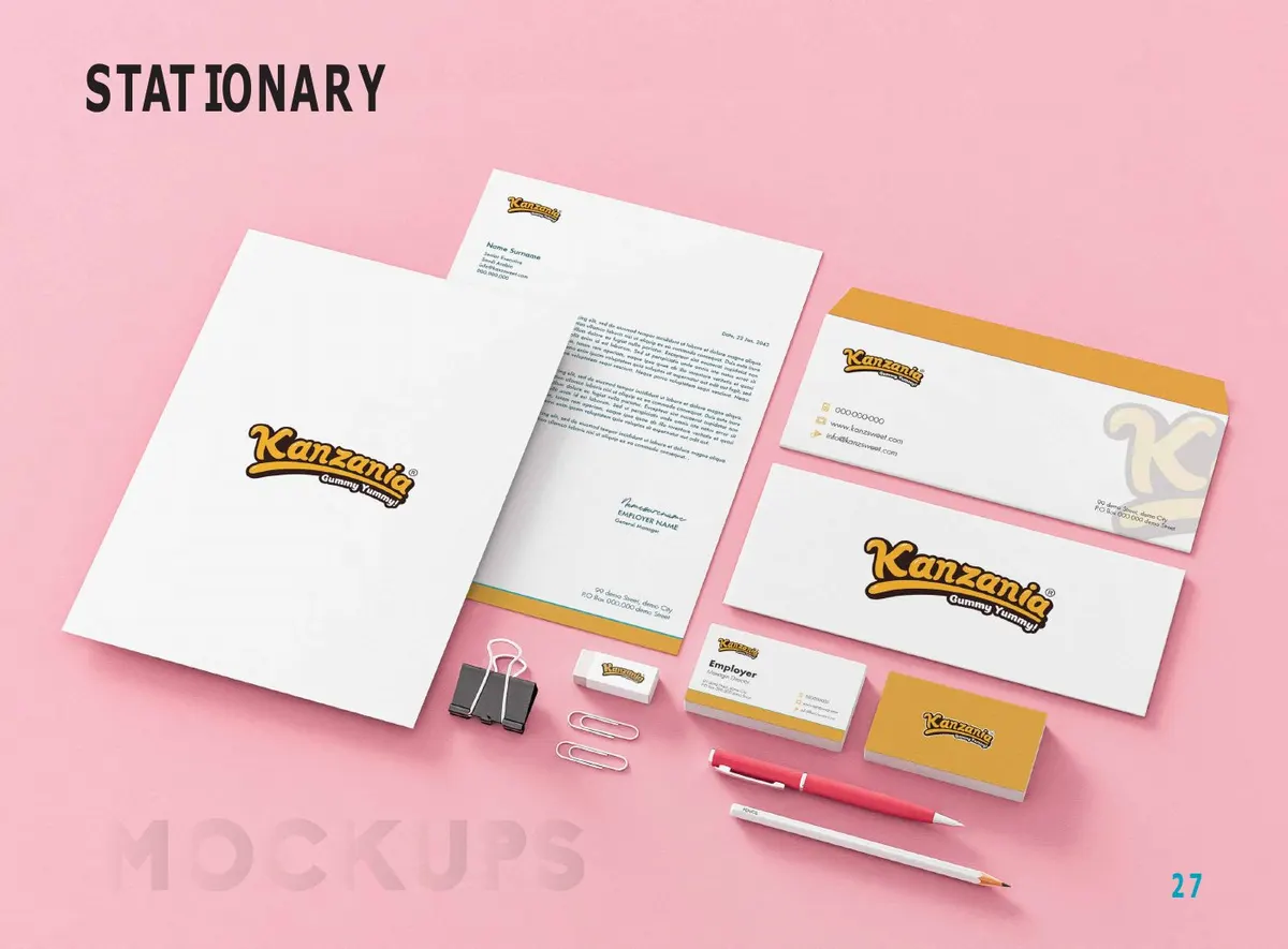
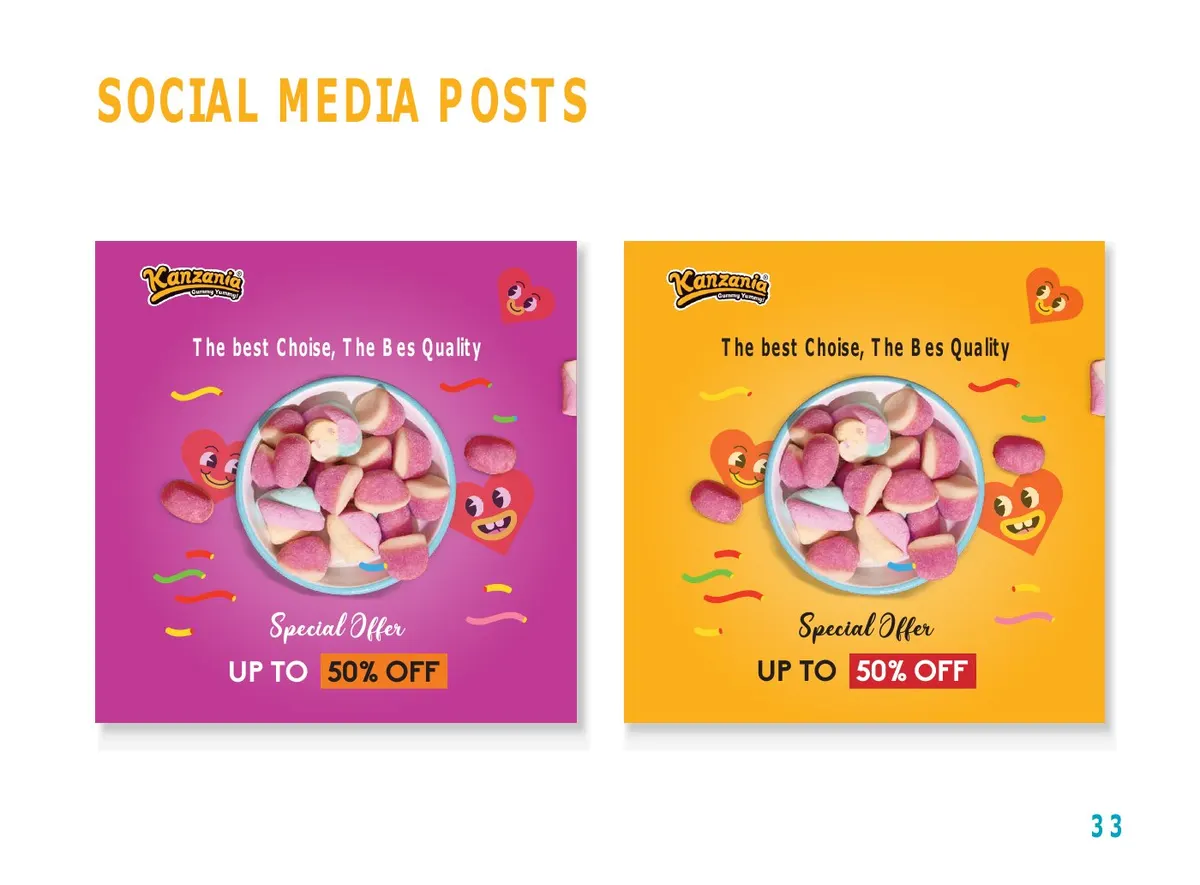
The selected pages show packaging variations, stationery and social post examples, supported by rules for logo spacing, colour and typography.
Watan’s role
Developing Kanzania’s bilingual system, extending its playful wordmark and colours across product packaging, stationery and social applications.
Why this approach
A colour family and shared rules allow product variation while preserving brand recognition.
Brand identities

A complete sporting visual system, from the federation emblem to equipment, stationery and outdoor applications.
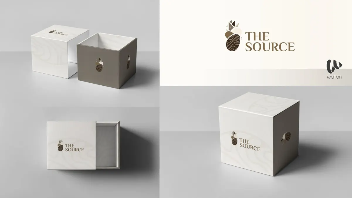
A restrained visual identity expressed through packaging, shopping bags and brand stationery.
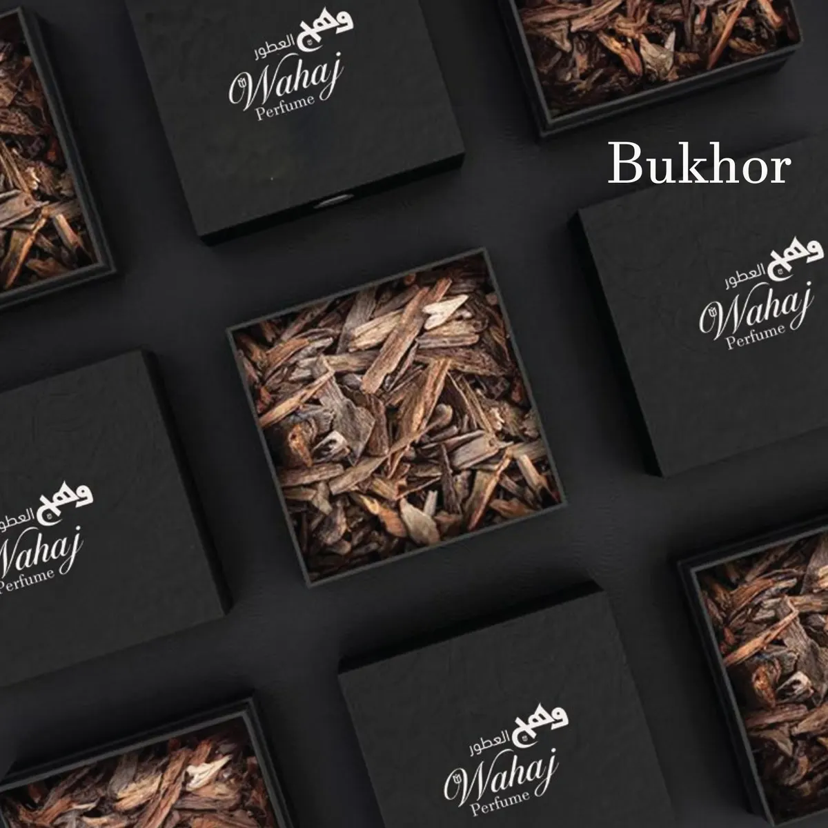
A perfume identity system spanning product families, packaging and social content.